Podcast: Play in new window | Download (Duration: 30:29 — 41.4MB) | Embed
Subscribe: Apple Podcasts | Spotify | Email | TuneIn | RSS | More
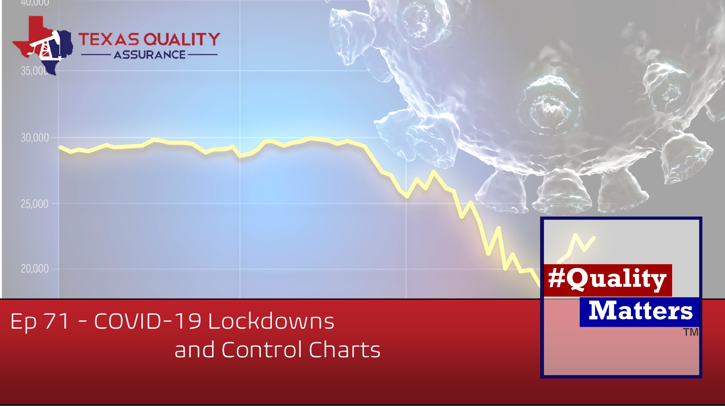
COVID-19 is still a very hot topic in the United States. Of course, we like to share with you how quality matters in all aspects of your life. Whatever you feel about COVID, masks, lock-downs, back to school, and the government, COVID affects you. We came across a Deming Institute blogpost about a man in India that used control charts to put into perspective the information that residents were getting daily. India is one-third the size of the United States, but about 4 times the people. As you can imagine, the fear of the spread was serious.
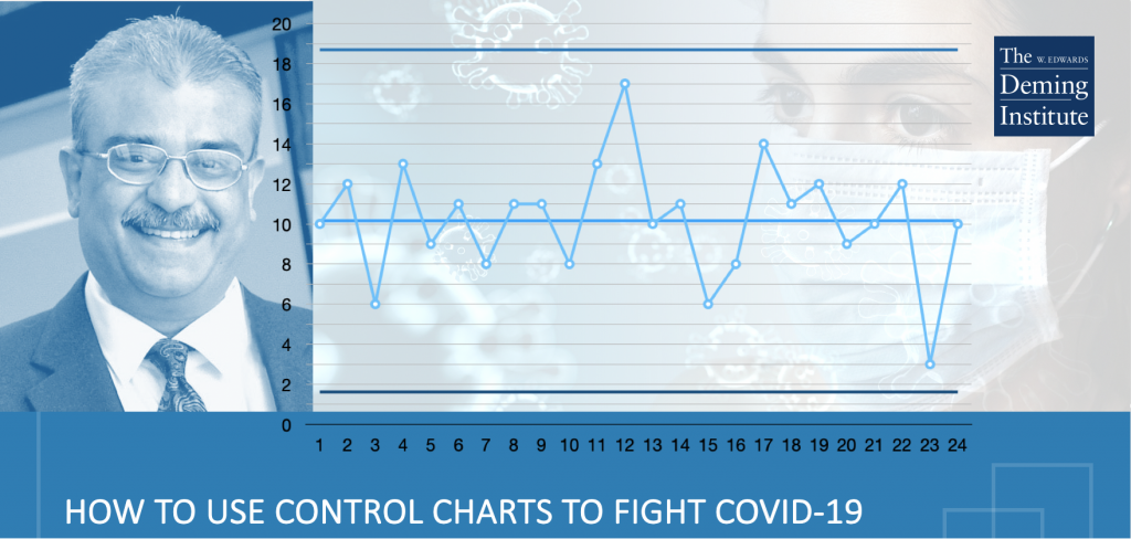
The media was putting out very scary numbers and one man, Balaji Reddie, who is the founder of The Deming Forum India, decided to take those numbers and put them in perspective to reduce the rising panic. Control Charts work to define your upper and lower limits and you want to stay within those ranges. So, Reddie worked the numbers to create rations of positive cases per day to the number of tests conducted, recoveries to the number of cases daily, and fatalities to the number of cases daily. These charts worked to show if the system was stable. Reddie knows people in high places and sent his charts with his own interpretations to those people. He got an overwhelmingly positive response and was asked to keep sending in updates. To give an idea of perspective, India (as of July 16, 2020) had reported 969,000 confirmed cases. Wow, that sounds scary! However, 613,000 people have recovered.
Another perspective, India has a population of 1,353,000,000. That means that only .07% of their population has contracted COVID-19, that’s not so scary. We could argue that the numbers would probably be different had they not enforced a lengthy lock-down, but that’s not the point. I am asking United States health providers, media and government to put the numbers in perspective to stop inducing panic and properly inform citizens. The struggle is that many people don’t believe what is being reported due to inflated numbers, reports of false positives, and many other stories that are circulating. When you put numbers in a control chart in a ration or a percentage that puts things in perspective, it allows people the opportunity to make a more reliable, informed decision.
Stay tuned folks, because our Host Darci Chambers is going to be hosting a new podcast “The Practical Roustabout” learning about real life Oil & Gas business, opportunities to get into the field, education and skills required and generally just more about this amazing industry. We are looking for guests, if you’re interested, contact Darci on LinkedIn or email [email protected]
Learn more about #QualityMatters & Texas Quality Assurance :
LinkedIn | Facebook | Twitter | Instagram | YouTube
www.qmcast.com | Texas Quality Assurance |
Learn more about #QualityMatters & Texas Quality Assurance :
LinkedIn | Facebook | Twitter | Instagram | YouTube
www.qmcast.com | Texas Quality Assurance